

NACS
UI, UX, Development
Awwwards
The Fashionable Challenge
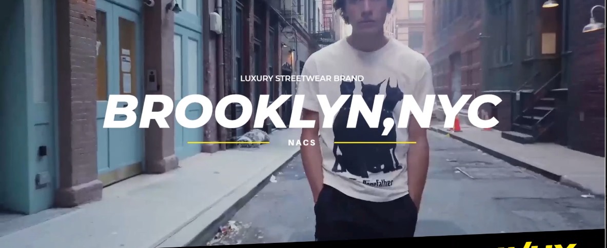
NACS needed an online store that screamed Brooklyn street culture—raw, bold, and effortlessly cool—while keeping the UX minimal and frictionless. The balancing act:
- Avoid clichés (no overused "urban" tropes).
- Prioritize speed for hypebeast impulse buys.
- Let the clothes (and attitude) shine without distracting design fluff.
The Hypebeast Approach
- Photography as the Foundation:
- Leaned into a high-contrast, edgy photoshoot—graffiti backdrops, raw studio shots, and candid street snaps.
- Used a looping homepage video of Brooklyn streets to drop visitors into the brand’s world instantly.
- Design with Teeth:
- Big & Loud Visuals: Oversized product images and bold typography mirrored streetwear’s "in-your-face" ethos.
- Micro-Animations: Subtle hover effects (e.g., graffiti-style color splashes on buttons) added playful energy.
- One-Click Hype:
- Simplified checkout flow (3 clicks max) with a sticky cart and Apple Pay integration.
- PDPs That Convert: Size guides styled like subway maps, FAQ drop-downs, and 360° product spins.

The Drop-Day Results
- 50% Increase in mobile conversions (thank you, Gen Z thumb-scrollers).
- 25% Lower Bounce Rate—visitors stayed to "hang out" with the looping visuals.
- Featured in Hypebeast’s "Top 10 Streetwear Stores to Watch."
Conclusion
This wasn’t just an e-commerce site—it was a digital extension of Brooklyn’s sidewalks. By blending guerrilla aesthetics with buttery smooth UX, NACS’s online presence became as covetable as their limited-edition drops.
Creative Process Snapshot
Mood Boarding → Street Photography → Brutalist Wireframes → Animation Prototyping → User Testing → Hype Launch